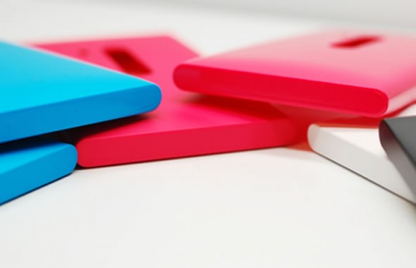
In a tech world dominated by black and silver, Nokia took a different path when designing the polycarbonate body for its Lumia smartphone series. In a post at Conversations by Nokia, materials designer Tiina Aarras takes us through the long decision process that led to the iconic cyan, magenta, black and white bodies of the Lumia N9, 800 and 900.
An integral part of the design is that the plastic in not painted on top, the color that you see is the color of the plastic. So if you scratch the body, you would still have the same bright original color. From the designer’s mouth, it’s not just plastic, it’s a single piece of polycarbonate plastic. And they’re not just colors – they’re the most saturated, intense colors you’ll find on a phone.
The inspiration for those colors came from the CMYK color model (cyan, magenta, yellow and black). If you’ve ever dealt with professional printing then you might know that these are the four inks used in color printing. The model was invented in the 1890s when newspapers began to include color comic strips. The design team came up with this combination after studying over 100 colors.
Those colours are pure, defined and exceptional. They’re distinctive modern design icons and people recognise them.
says Tiina. Of course we’re currently missing a yellow Lumia, but that could be in the pipeline soon. The white came from the association of CMYK inks to paper: So you have the purest white body which creates a nice contrast with a black glass screen.
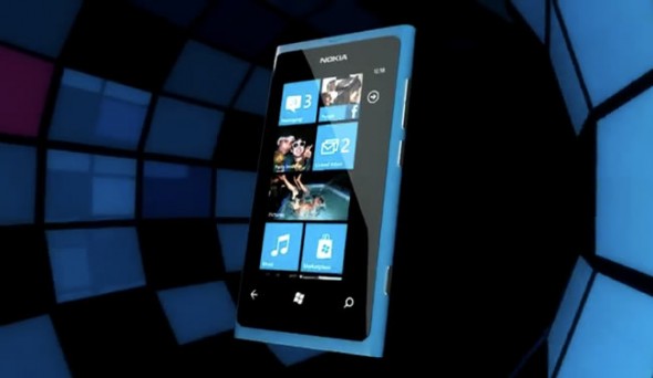
We personally think that the bold palette also matches the Windows Phone‘s Metro UI, with its own intense colors and typographical origins.
[Conversations by Nokia]
